Deep Insight Newsletter
A research newsletter that translates clinical complexity into a calm reading rhythm.
2024
4 days
UI/UX Design Intern, Bayer (China)
Figma
#Editorial · #Visual Design · #Healthcare
An internal newsletter for Bayer's Kerendia (Finerenone) team. The brief was clarity — translate dense clinical findings into a layout that respects the reader's attention.
The ask
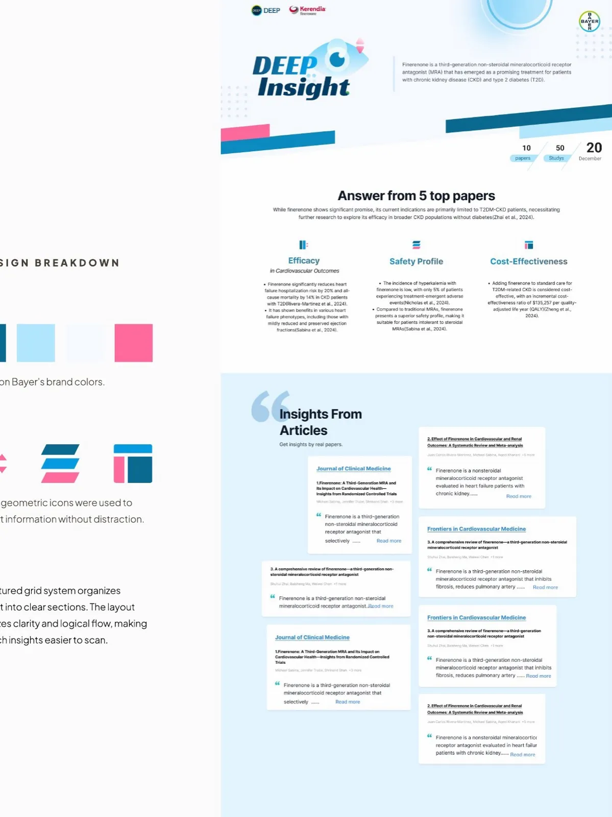
Bayer’s medical team needed an internal-comms newsletter to share key findings on Finerenone — a third-generation non-steroidal MRA being studied for chronic kidney disease and type-2 diabetes.
The audience: cross-functional colleagues, not all clinicians. The challenge: take five top papers and ten months of research, and make a single page that someone could scan in a minute and walk away informed.
Layout strategy
A structured grid organizes the newsletter into clean tiers — top metrics, the three pillars (Efficacy, Safety, Cost-Effectiveness), then a content row of paper summaries. The eye knows where to land first; the rest invites only when the reader’s ready.
I used consistent typography and spacing scales across blocks so a long page never feels long. Subtle gradients and circular graphics suggest insight and continuity without competing with the data.
Visual direction
- Brand color anchor. Bayer’s signature blues and pinks lead; everything else recedes.
- Geometric icons. Simple, almost diagrammatic. They support information; they don’t decorate it.
- Soft accents. Light gradients and circular forms reinforce the editorial calm — important in a context where the content itself is heavy.
Process notes
Most of the four-day timeline went into talking. Daily reviews with the Medical China team, scope alignment with brand guidelines, and a careful read of every claim to make sure visualization didn’t misrepresent the underlying data.